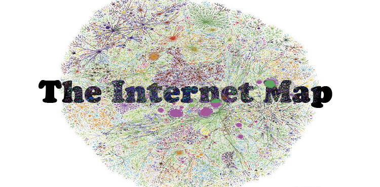
The Internet Map shows relationship b/w 350,000 websites
Have you ever tried to imagine what The Internet Map might look like? Well, think no more. Ruslan Enikeev, a Russian developer, used 350,000 websites from 196 countries to create the map. However, unlike real maps (e.g. the map of Pakistan), the objects on it are not on any physical surface. Enikeev wrote on his website’s about page that he created the map because in his mind “the Internet global network … surpasses anything mankind has ever created.” The map is an “attempt to look into the hidden structure of the network” and understand the complicated Internet “statistics figures”.
How Does The Internet Map Work?
Technically, the map showcases the links between websites on the Internet. Each circle represents a website. The amount of traffic determines the size of the circle. Therefore, the larger the traffic, the bigger the circle gets. Links are created when the user’s jump from one website to another. The stronger the link, the closer the websites arrange themselves around each other. The colour of the circle corresponds to specific countries.
- Turquoise: International (middle)
- Red: Russia (North-east) / Spain (East)
- Dark Blue: Germany (East)
- Purple: Japan (South-east)
- Yellow: China (South-west) / Brazil (South)
- Pink: Iran (South)
- Light Green: South Korea (South-west) / India (North-west)
- Brown: Pakistan (on the right side of google.com circle)
Websites Relationships
If you type Pakistan in the search box, google.com.pk will get zoomed in. The other websites besides this circle are jobinpk.com, minhaj.org, and quranreading.com among others. To explain, users in Pakistan tend to use Google as their main search engine to go to other websites.

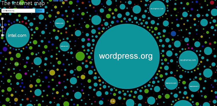
WordPress.com is on its own in the north-east. Since this is a corporate site, no one links to it or goes from this website to other sites.

Whereas, wordpress.org is towards the middle with many other smaller circles around it. Some of the websites around wordpress.com are woocommerce.com, adesblog.com, and appthemes.com. In other words, people use WordPress to find themes for their websites, create blogs and personal company websites.
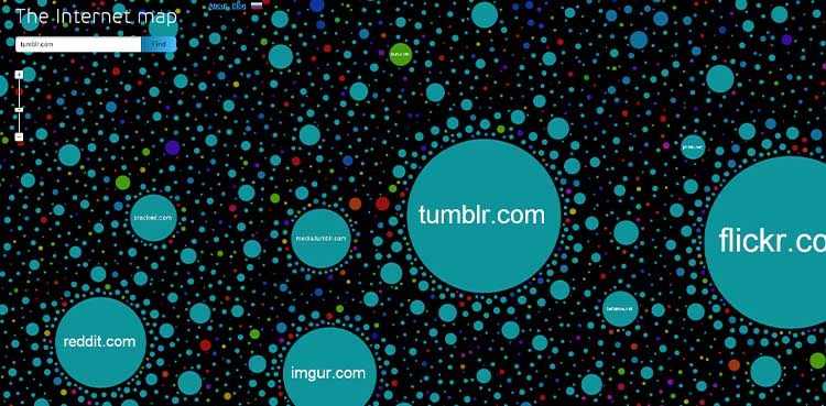
Buzzfeed said, “this is ‘screwing around on the internet’ section”. It includes Tumblr, Reddit, Imgur, Flickr, and Buzzfeed. This basically means that users tend to waste their time by jumping from one site to another, which led to all these sites getting bunched together.
Other Inspirations
The Internet Map inspired Enikeev to create The Disease Map. It is a scientific project between Taiwanese Taipei Medical University and the Australian University of New South Wales. The concept behind this map is to display the current human diseases using the same algorithm of The Internet Map. Check it out at http://disease-map.net/.

